abstract
1.
existing in thought or as an idea but not having a physical or concrete existence.
2.
relating to or denoting art that does not attempt to represent external reality, but rather seeks to achieve its effect using shapes, colours, and textures.
1.
existing in thought or as an idea but not having a physical or concrete existence.
2.
relating to or denoting art that does not attempt to represent external reality, but rather seeks to achieve its effect using shapes, colours, and textures.
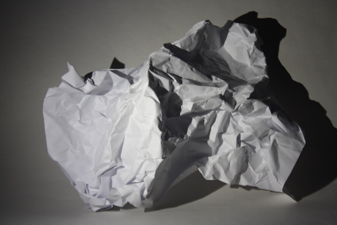
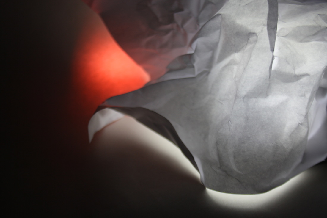
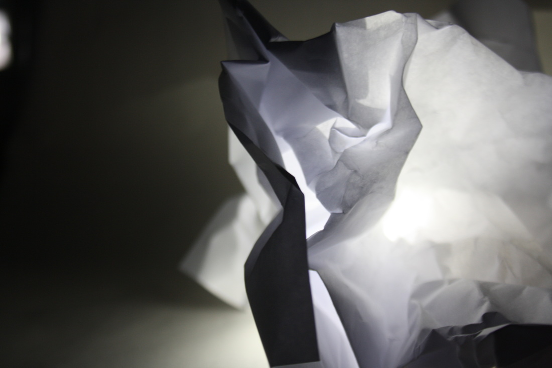
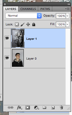
The white paper test
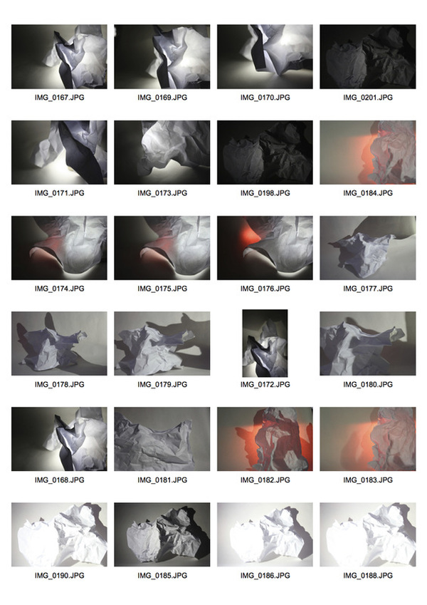
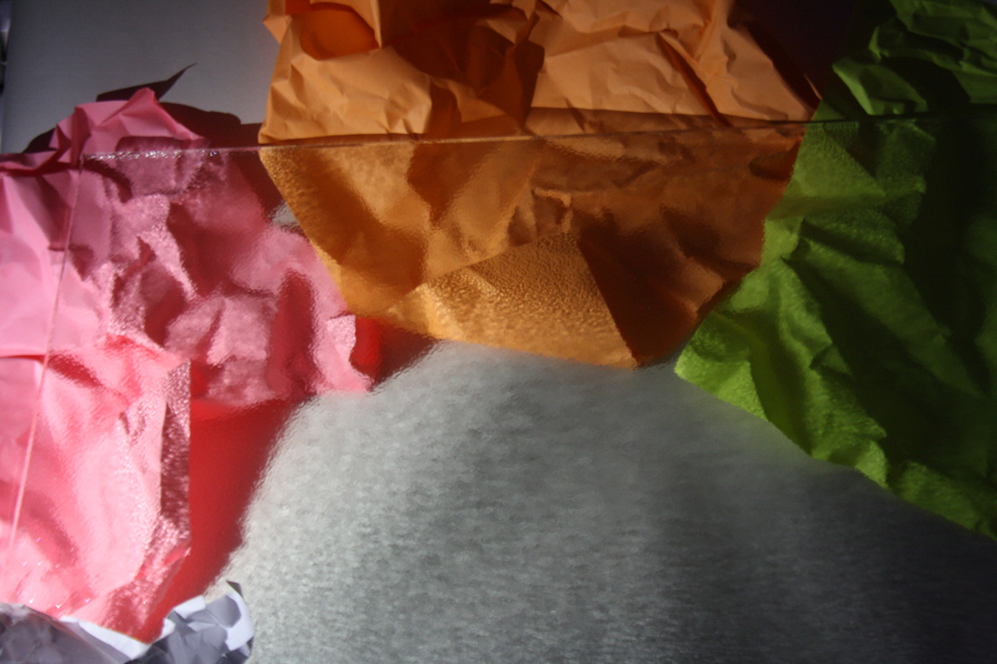
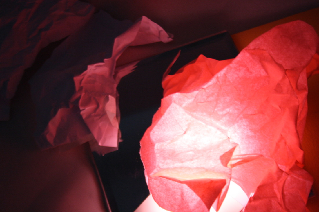
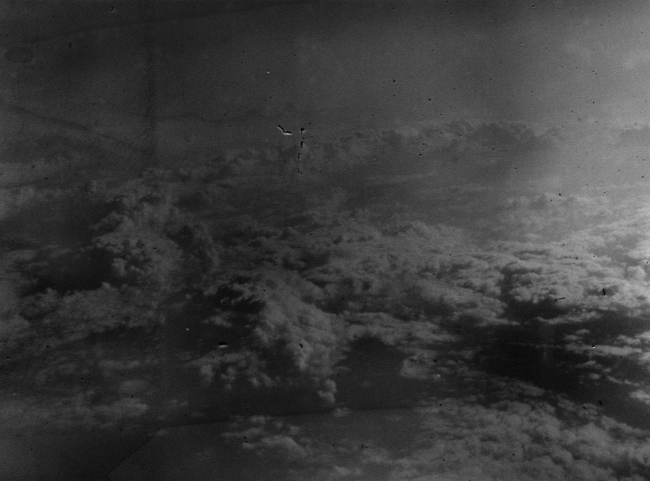
For this task, I captured 24 images of the same subject - a sheet of white paper. However, during this photoshoot, I crumpled, twisted and rolled the paper in order to create different effects. With the use of the flash light on my phone, I managed to experiment with what I could bring to the photograph to make it a more interesting, detailed photograph. For example, I took both close ups and images further away. In a few of my final photographs, I was able to obtain distorted pictures where the subject did not look natural, or in this case it was harder to determine whether the photograph was of paper or something different, an ice burg or model for example.
|
|
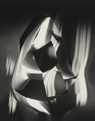
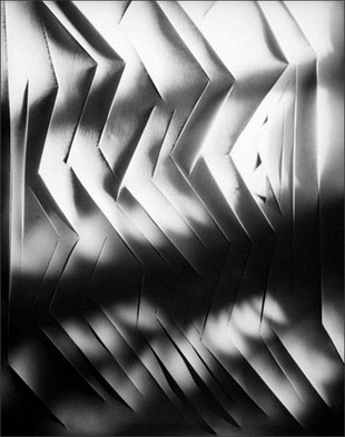
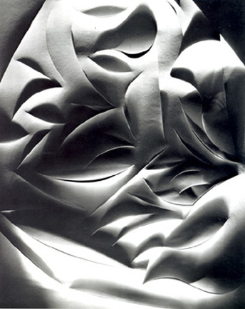
Francis Bruguière
Francis Bruguière (1879-1945) was an American born photographer. As well as this, he also worked as a directer, producer, painter and sculptor. The images Francis produced were often experimental and showed a peculiar shape and pattern. It is said that his photographs were captured under the impression of an abstract, surrealist or cubist creative way. The original event which inspired much of Bruguière's work was an earthquake which occurred in 1906 in San Francisco.
|
|
|
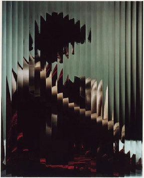
For these series of images, Bruguière has used one plain object to create detailed, interesting photographs. The subject (white paper) has been folded, twisted and cut to create multiple effects. With the use of light, Bruguière has managed to created a variety of alluring prints and in many cases it is difficult to formulate what the image is. Shadows seem to have a big impact on these images and play a big part in them. To create these kinds of effect, Bruguière had to select appropriate shutter speeds and aperture on his camera to construct his desired photograph. In both the first and second image shown above, it is easier to see that paper has been used to create interesting details. However, with the third and final image, there seems to be ore depth within the photograph, making the viewer question what may have been used to compose this image. All three of these images show examples of how only two simple components can create an interesting final photograph.
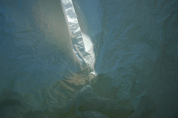
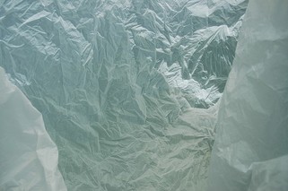
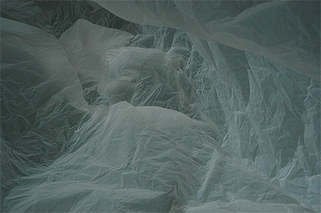
FRANCOIS DELFOSSE - 'antarctica in a bag'
Francois Delfosse is an abstract artist who photographs the inside of a single, simple plastic bag, therefore creating the effect of 'Antarctica in a bag'.
|
|
|
In all three of these images, Delfosse has used a white plastic bag to create an arctic style environment. He has accomplished this by photographing the bags very close up in order to distort the object. Delfosse has also used blue and cool toned lighting to make the images seem like they have been taken in a bright but cold environment, like the arctic. Delfosse scrunched up the bags before photographing the images to create both depth and texture to the images. Therefore, I think he was most likely using the formal element of texture to influence the composition of the image. All the images are very similar as they were most likely taken with the same plastic bag. Although they are similar in many ways, They also have many differences to them. For example the bag in all three images has been placed in a different shape and the colour and the source of the light is different in all three. The light in the picture on the far right is coming from the back of the bag and the image in the middle is coming from the front of the bag. The change of origin in the light creates different shadows in the images. Exposure time can also be important in determining how light or dark the image turns out to be and this case can create a more warm or cool image. The image on the left differs from the other two. This is because there is a streak of light down the centre of the composition. This causes the viewers attention to be placed on the centre as the brighter light contrasts with the dull shadows surrounding it.
development
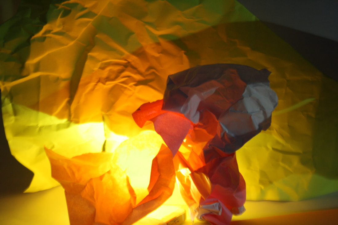
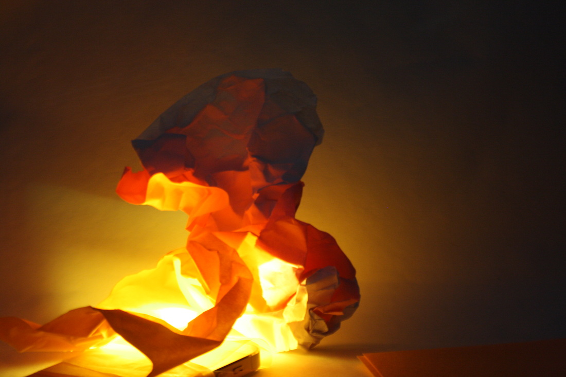
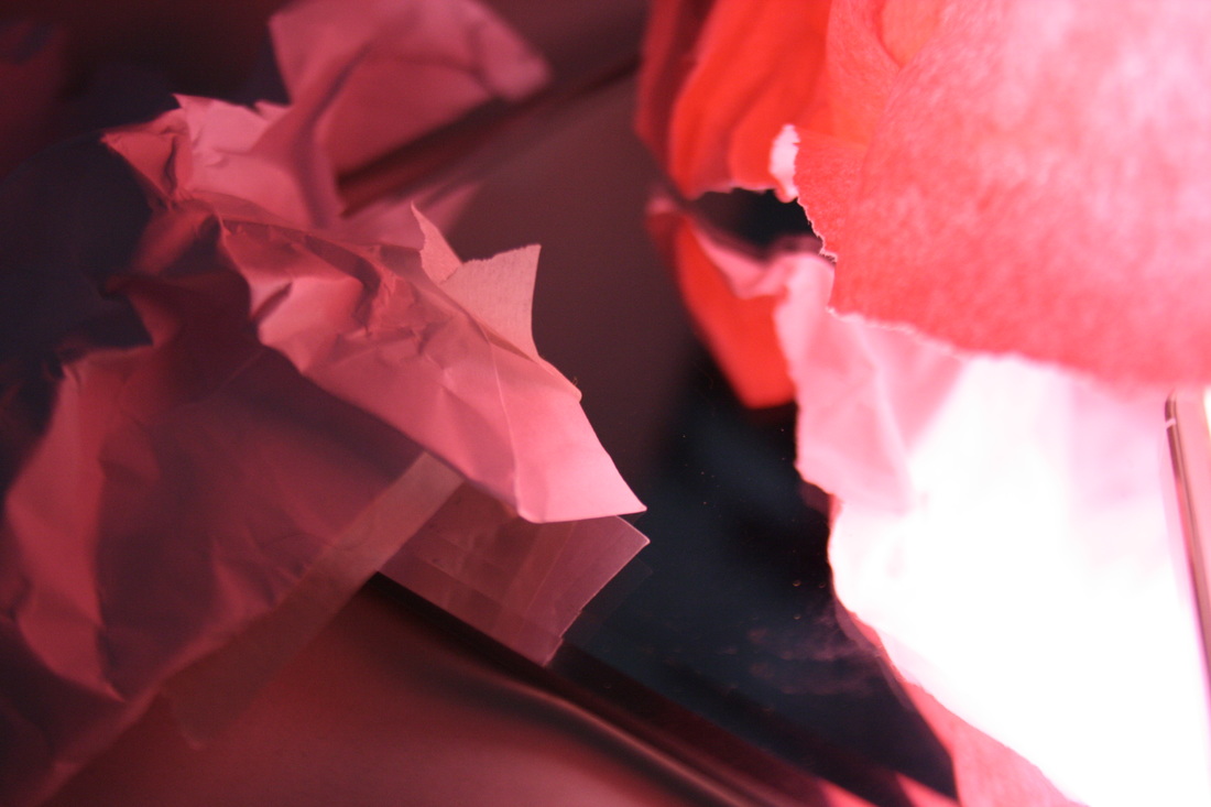
For my development of this task, I bought in coloured paper, coloured gels and detailed glass. With the coloured gels, I covered my flashlight with them to get a coloured light. I then placed the light beneath the paper and managed to create a range of interesting pictures. After capturing a few good images, I moved onto using mirrors and glass. I like the use of these as in my opinion it brings out a certain unnaturalness to the photograph. It helps show a clear contrast between things I have been able to fold and crumple and more harder materials, of which I could not do so. Two of my favourite images from this series are the two I have produced larger. This is because I feel that the light plays a big part in creating these interesting images. The left photograph almost looks as if it is on fire whereas the right is interesting as the strong light contrasts with the darker edges, capturing the viewers attention.
|
|
|
|

|
|

|

|
development and digital manipulation
For this task, I decided to develop my images even further with the use of Photoshop to create a more abstract image. For my first image, I used a previously captured image to create a kaleidoscope. Following this, I decided to develop further by making a GIF.

Original Image

Kaleidoscope Development
|

GIF
|
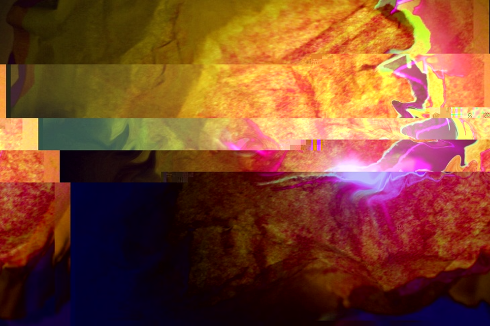
For these two images. I used the gradient tool on Photoshop to create more vibrant colours and contrasts. By adding in more colour, I feel that I managed to obtain a more abstract image. Following this, I developed this image further by using text edit to create a glitched effect. However, the glitch did not turn out the way I hoped it to so I will experiment more with it and will hopefully create a better final image.

|

|
development

|
|
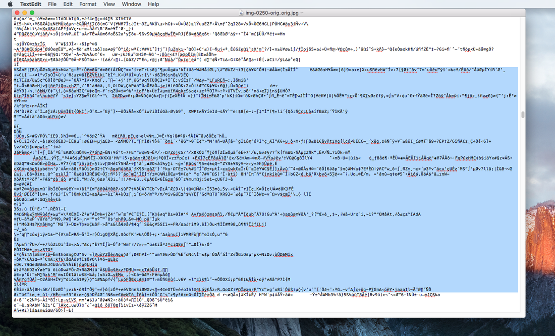
By removing chunks of texts from text edit, I was able to create a glitched image.
dark room manipulation
As well as digital manipulation, photographs can also be manipulated manually with the use of the dark room and the developer, stop and fix chemicals. To create the images below, I printed out an image on an acetate sheet. I then went into the dark room and placed the acetate over a sheet of light sensitive paper in my desired position. After doing this I exposed the photographic paper for around 2 and a half seconds. Moving my final image through the developer, stop and fix I managed to create a positive black and white image. However, to make this more abstract, I placed this image in a tray of bleach and left it there for around 5 minutes. This began to distort the image and it became easy to wash off some of the developed areas. I used a forceful tap and ran it over the right side of the image, distorting it even more. For my second abstract darkroom manipulation, I exposed my image as the same as I did before but instead of coating the whole image with developed, I used a paintbrush to paint on and create a more abstract final piece.
Acetate

Painting on developer
|
Bleach effect
|
chemigrams
After using the dark room to manipulate my images, I then went on to use different materials to create the same effect. With this method, I was able to do it in the light. I positioned materials such as moisturiser, masking tape, honey and oil on a sheet of photographic paper and then put this paper in the fix chemical. This turned all the areas which were not covered white and then when I transferred this to the developer, the covered areas began to get darker, creating a more abstract image.
linked artist - Daisuke Yokota
|
|
|
Throughout this task, I feel that I have developed my ideas as far as I can and have shown a variety of techniques. However, with the digital manipulation I forgot to show screenshots of how I managed to create the GIF and kaleidoscope. As the image I used was vibrantly coloured, I feel there was lots of details and it worked with the topic of abstraction. To improve this task I could have done more darkroom manipulation and experimented with other photographs. Also, creating more chemigrams would show a range and variety of images relation to abstraction.
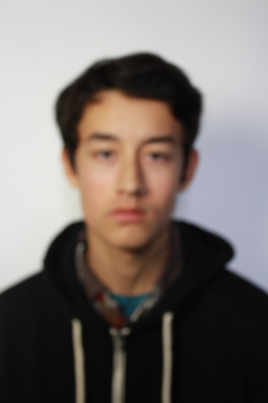
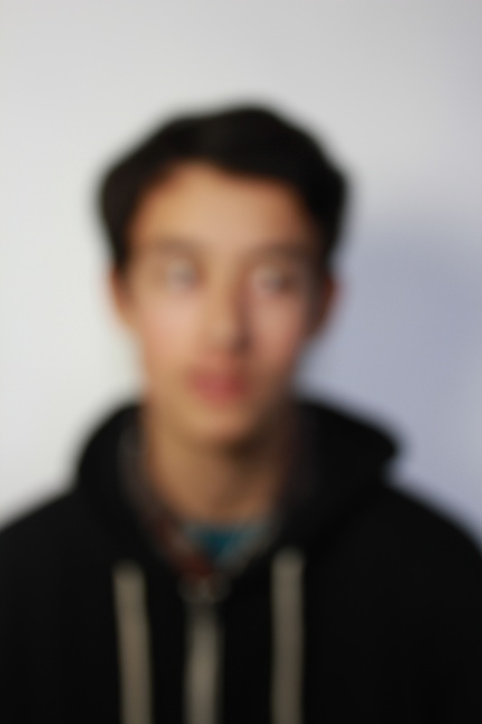
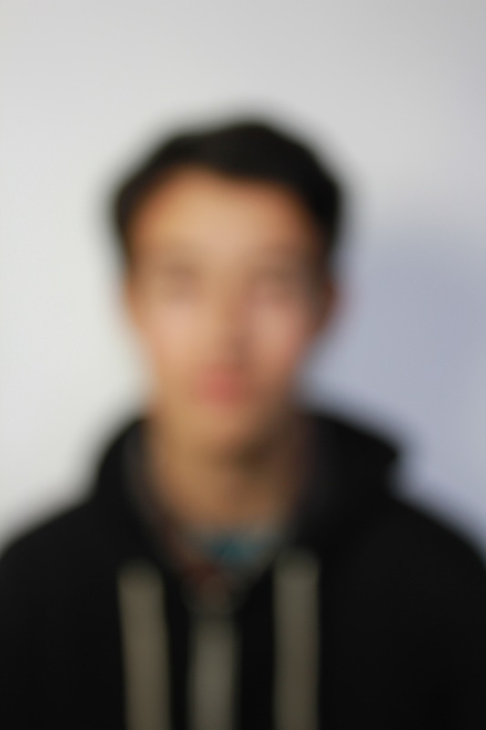
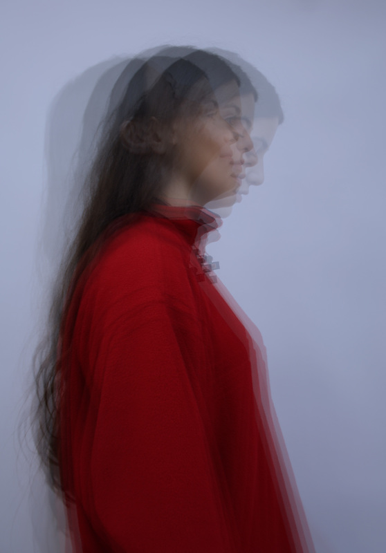
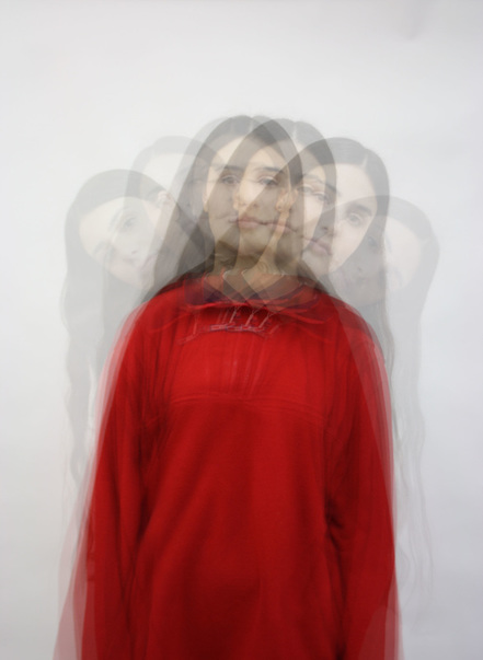
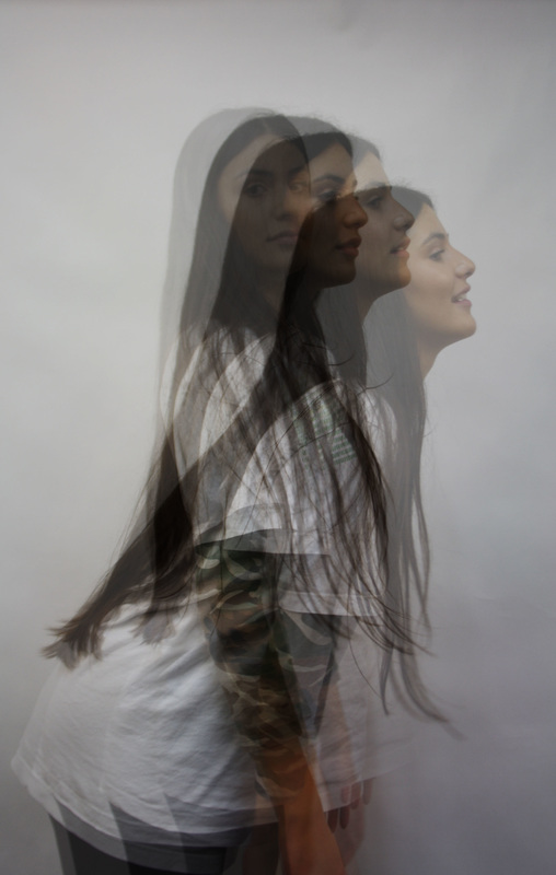
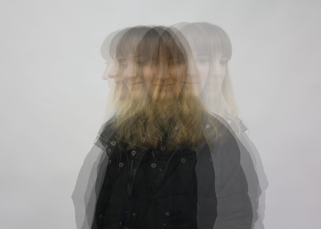
abstract portraits
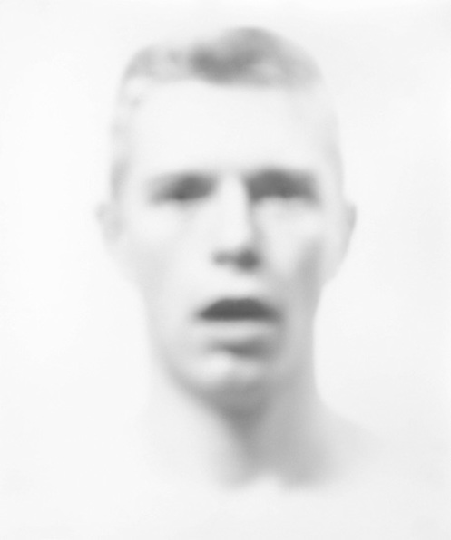
For this task I looked at distortion of portraits through the use of blur. To do this, we selected the manual focus setting on the camera and manually changed the focus so that the image ended up blurred.
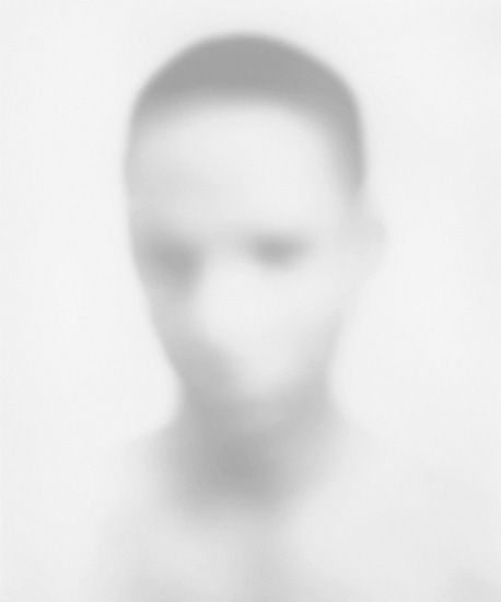
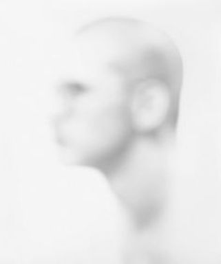
bill jacobson
Bill Jacobson was born in 1955, Connecticut and is widely and most famously known for his blurred and distorted photographs, both portraits and landscapes.

|
|
|
Throughout his work, Bill Jacobson creates the idea of a metaphor showing an interior way of being and an inner state. He creates this by blurring, defocusing and diffusing the portraits upon the time he is capturing them. By showing this, he wanted us to be able to consider and question the sense of futility whilst trying to capture human likeliness. It is clear from Jacobson's work that he has a certain view of the human passage of life and he therefore represents this in his work. He creates original pieces of work which leads the viewer to think about the intentions used to create such original, unnatural portraits. Bill Jacobson is considering and presenting his view on how he sees human life. He first gained interested in this when falling upon old snapshots at different flea markets and exploring the 'layers of time' of which these images revealed. It could be said that Jacobson considers society as he chooses to show how life is seen. This is shown throughout his work because the photographs deny any representation of physicality and have no detail or depth. Bill Jacobson was interested in this issue because he was inspired by the work or Roland Barthes who wrote that every photograph is of a dead moment. Jacobson also quotes 'I've learned over the years that artists make the work, and then viewers come away with whatever they choose, their own interpretation'. This may be interpreted that Jacobson's work is not presented to form a certain way of thinking but it is to put forth another option and insight into how human life can be perceived. To construct his work, Bill Jacobson appears to blur his images before capturing his portrait and therefore does not use digital, technical manipulation with the use of software such as Photoshop. Without the use of unnatural manipulation towards the image, a more ordinary effect is created. This means that his work is easier to relate back to reality and backs up his own view and interpretation of how life is viewed. The sense of anonymity is also portrayed throughout his work creating a more individual effect. The images above are smudged and blurred making the crisp details less visible and therefore an abstract photograph is produced with a surreal finish to it.
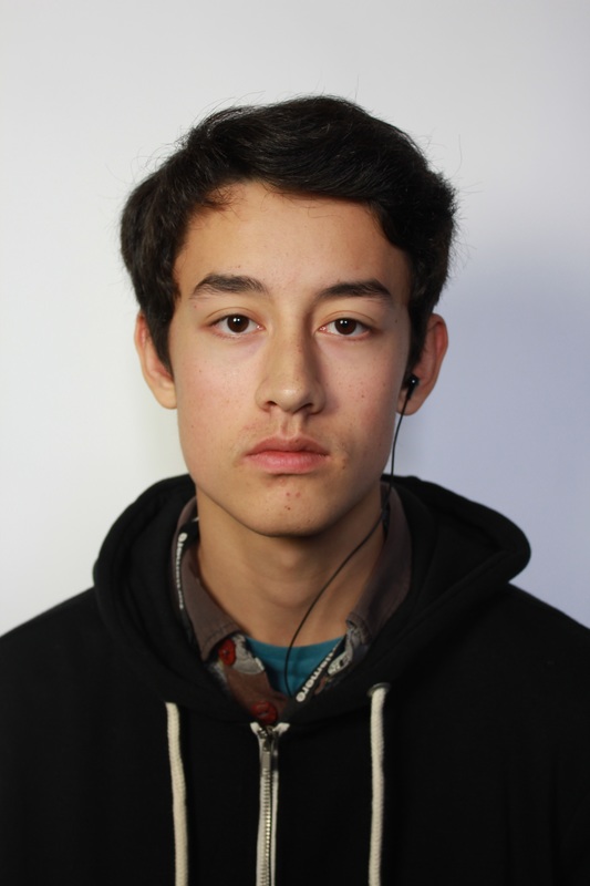
My response
|
|
|
|

|
|
|
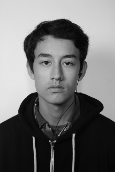
artist and me
Bill Jacobson's Work
|
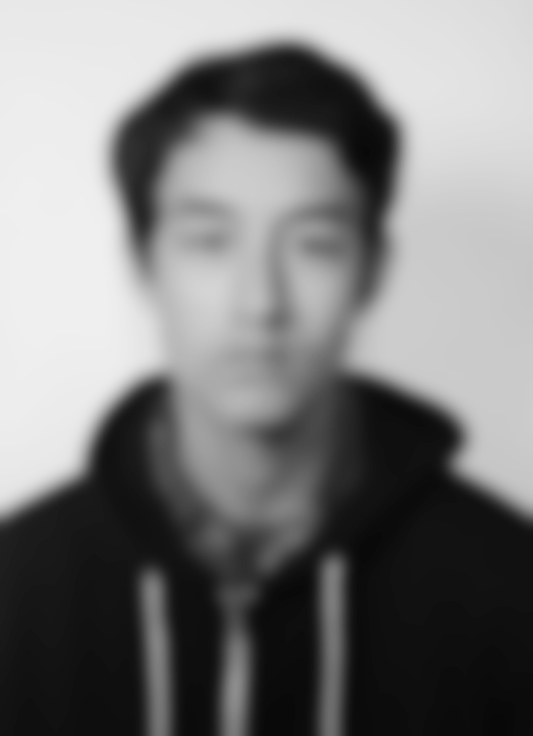
My Work
|
development
New Project 6 from Charlotte Davies on Vimeo.
Erwin Blumenfeld
Erwin Blumenfeld was a German photographer and artist born in 1897. He was famously known for the fashion photography which he presented in magazines such as Vogue and Harper's Bazaar (in the 1940s and 1950s). Adding to this, he was also interested in celebrity portraiture and fine art photography. He has been labelled 'one of the most innovative and influential photographers of the 20th century.
|
|
|
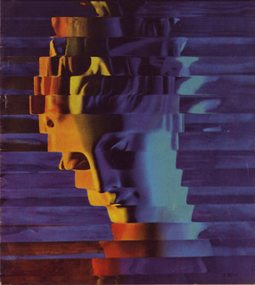
In this photograph, Blumenfeld has used darker colours to bring more mood and effect to the image. The subject of the composition is particularly dark, with deep colours such as black and crimson. This contrasts with the background which is a lighter, grey colour. This effect can be related to the subject, who appears to be serious and downcast which therefore manages to create a more dominant photograph. The lady in the photograph is positioned in the centre meaning that the viewers attention is drawn to her. As she has been broken up and distorted in vertical sections, we are unable to fully view the expression on her face and therefore we can only assume, from her positioning and the colours that Blumenfeld has selected, what she is feeling. The distortion taking place within this photograph makes it clear that Blumenfeld was interested in abstraction. The middle image is similar to the first. However, more vibrant colours are used, uplifting the photograph. Unlike the image on the left, it is easier to depict what the subject is in this picture. The womans face is more or less in focus and therefore the view is drawn straight to it. In contrast to this, the background and the top of her head has mainly been distored and disfigured in horizontal lines. This manipulates the image by emphasising the main focal point in the middle. On the right side of this photograph, more neutral colours have been used which end up contrasting with the left of the image where reds and yellows are brought in.
For the final image, Blumenfeld created a different image to his more famous work. In this image, no colours have been used and it could be argued that this is because the image would then be too busy. The main subject of this photograph shows detail and makes the viewer question how Blumenfeld could have captured this as successfully as he did. I think that this image was intended to be clear and simple as there are no objects used and the background is simple with the main focal point on the woman.
For the final image, Blumenfeld created a different image to his more famous work. In this image, no colours have been used and it could be argued that this is because the image would then be too busy. The main subject of this photograph shows detail and makes the viewer question how Blumenfeld could have captured this as successfully as he did. I think that this image was intended to be clear and simple as there are no objects used and the background is simple with the main focal point on the woman.
|
|
BEAUTY IN MOTION
Blumenfeld argued that beauty in motion/films is just as beautiful as the beauty in portraits and still photographs. In the 1960s, Blumenfeld became the director of the worlds first fashion films, hence 'beauty in motion'. The video on the left shows Blumenfeld's 'beauty in motion' and I feel like he represents a contrast of fashion, presenting it in a distorted way. By presenting these fashions in video form, the viewer is able to see lots of detail and the way the subject acts can show clear links with the associated fashion. Blumenfeld presents this video without any background music, placing more attention onto the subjects and composition of his work. |
my response
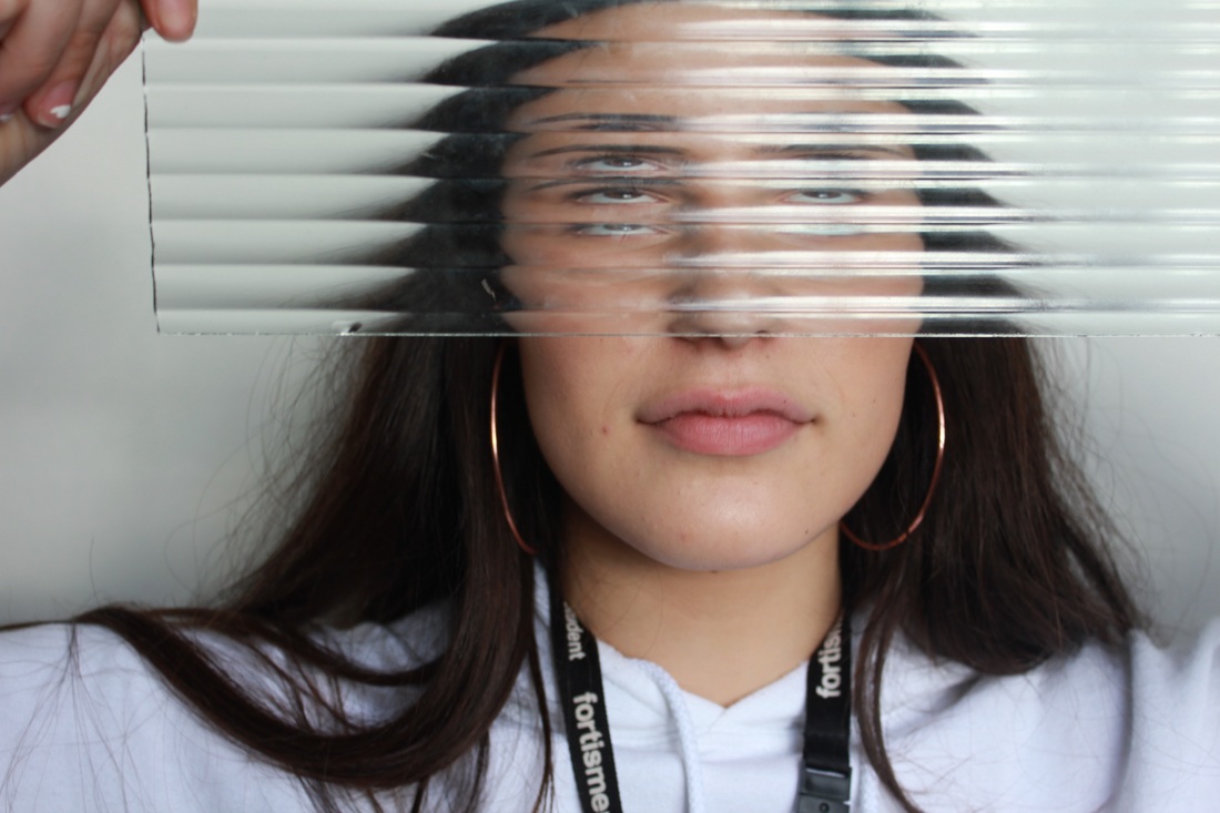
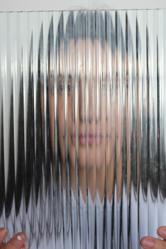
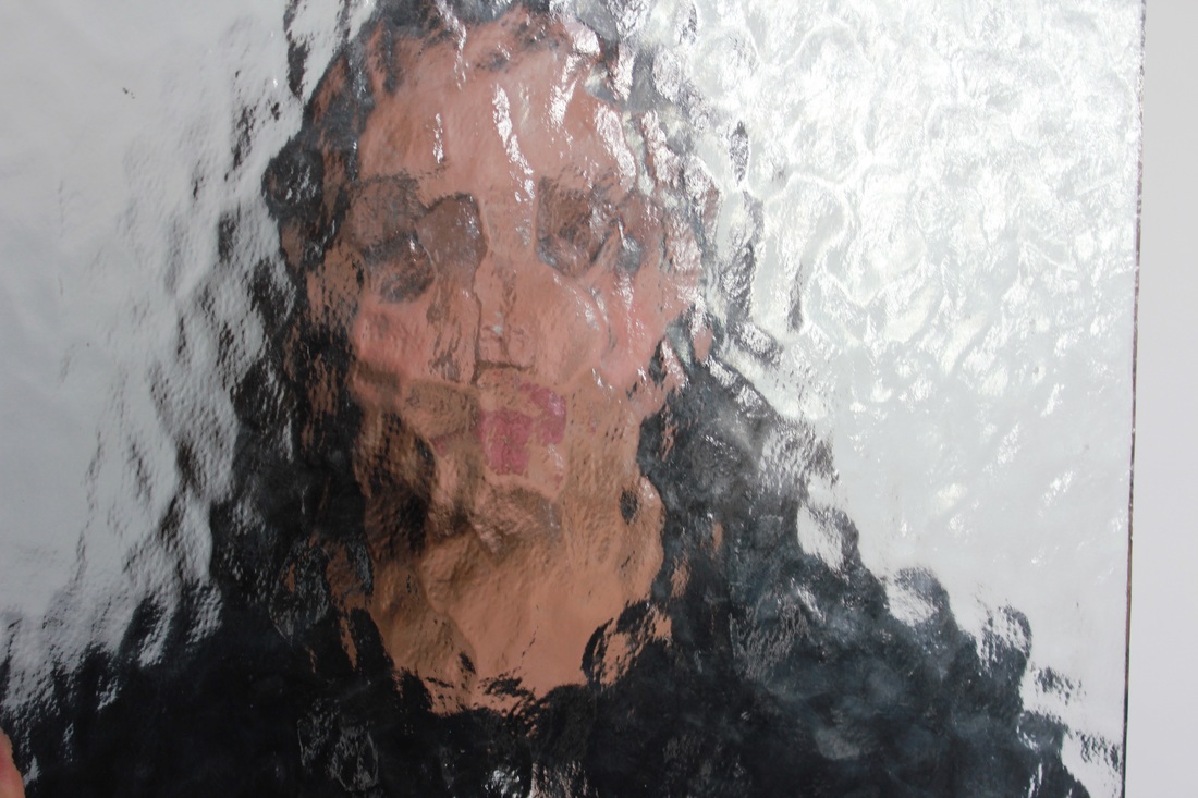
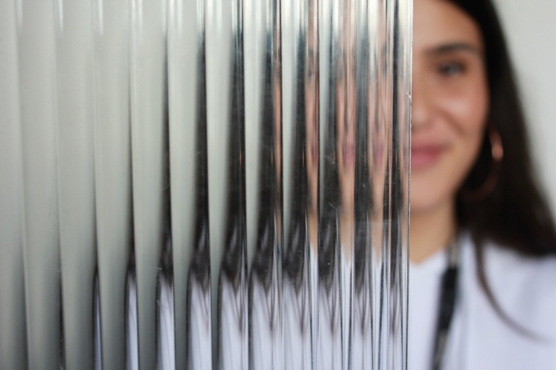
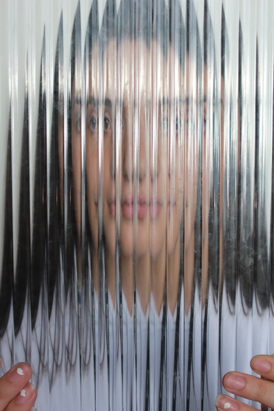
With my response, I used the studio and textured glass sheets in order to obtain an accurate response to Blumenfelds work. I feel that overall, my images turned out good as theres a variety of angles and techniques I used. My favourite image of all the ones I captured is the last one. This is because the indented lines on the glass are completely aligned with the frame, creating an accurate response. I then went onto creating a video to respond to Blumenfelds 'beauty in motion'. I think this went well as I continued to edit and develop it by slowing the movement down and adding a slight colour to it, in order to achieve a more colourful response.

New Project 5 from Charlotte Davies on Vimeo.
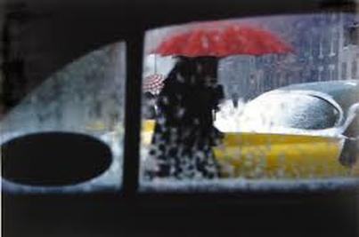
Saul Leiter
Orginally, Saul Leiter started off as an artist where he had an opportunity to meet the abstract expressionist 'Richard Pousette-Dart'. From this, Leiter was then encouraged to experiment with the use of a camera and became interested in colour photography around 1948. Following this, Leiter ventured into fashion photography and throughout 20 years, he worked with Vogue, Elle, Nova, Show and Queen. However, in relation to abstraction, Leiter explores the use of reflections and faceless silhouettes to portray disorder and creating an abstract effect.
|
|
|
|
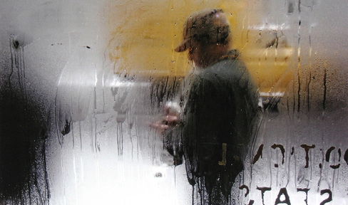
The first image provides curiosity into the busy streets of America. There is a dark subject in the centre of the photograph creating a curious, eerie atmosphere. The contrasting colours of the vibrant red and yellow bring detail to the photograph. The background is much lighter than the foreground, of which is the inside of what seems to be a car. This contrasts and brings depth to the image, showing the difference between the dry and the wet from outside. This makes the photograph effective as different arguments can be formed around it. The second image that I have selected is similar. Again, it has been captured with contrasting foregrounds and backgrounds of wet and dry. However, with the more neutral colour selection, there is less detail to cause distraction from the main subject. The man in
|
this photograph is dressed darkly which can be reflected on the weather which therefore brings a more interesting photograph where explanations can be obtained from. The composition relates clearly to abstraction as the steam on the window has been distorted and it is difficult to determine what is happening on the other side of the window. Both of these images show ominous atmospheres as no identity is shown.
three strands
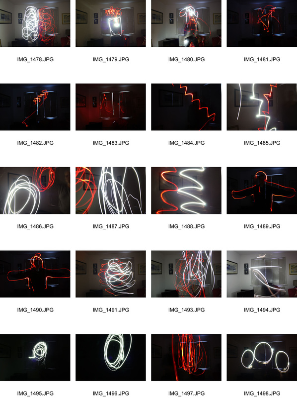
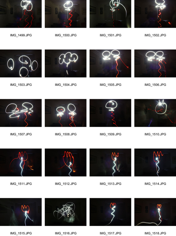
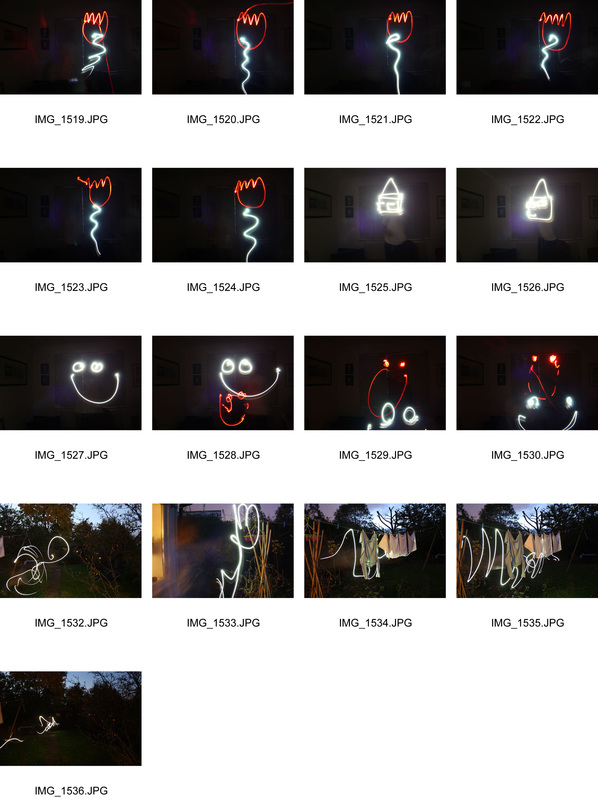
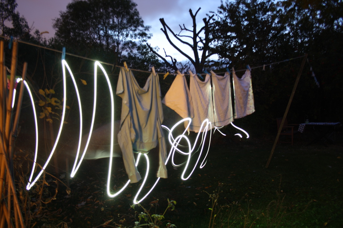
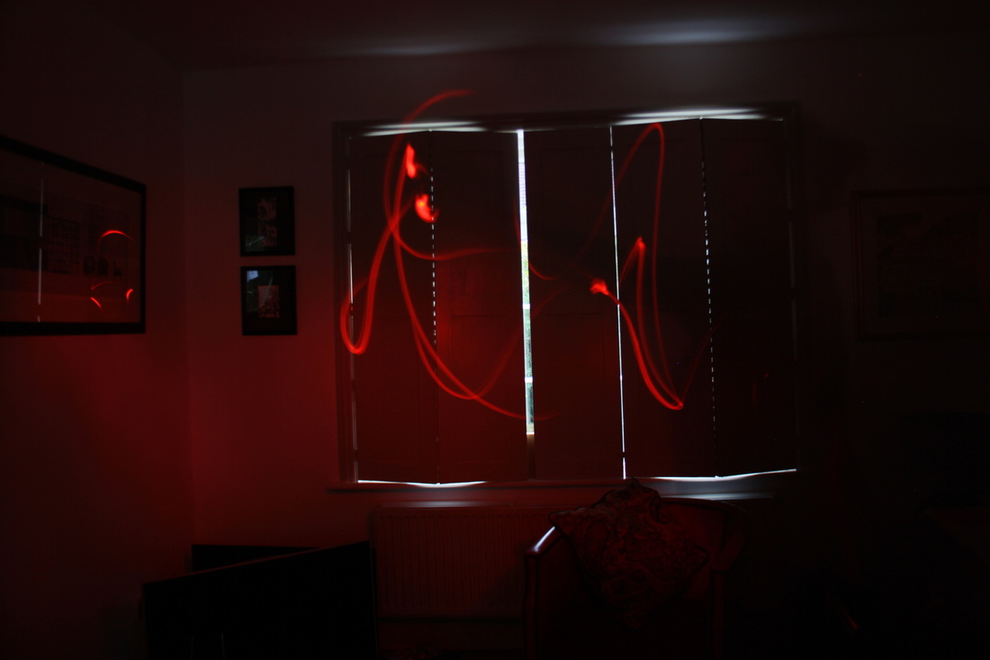
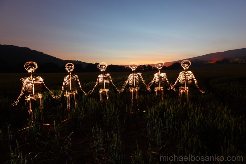
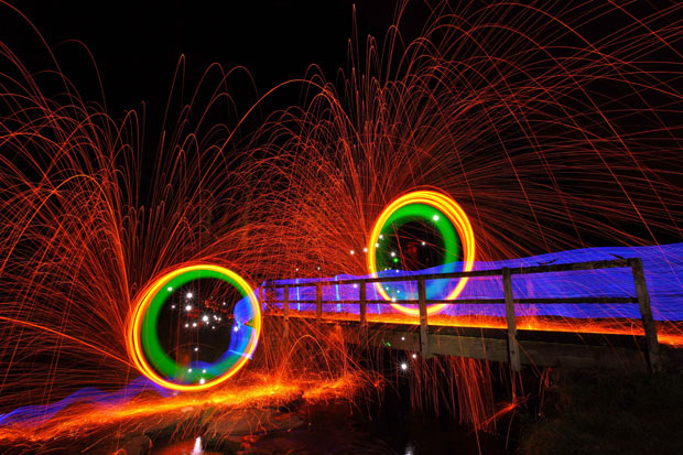
strand one - light painting
For my first strand I decided to look into how long shutter speeds can distort the image when a flashlight is used to create images. I looked at the work of Michael Bosanko and then tried experimenting by myself.
|
|
|
|
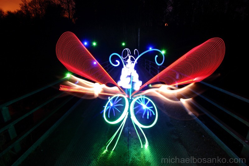
Michael Bosanko
|
|
|
Michael Bosanko first came across his famous light painting technique when, on accident, he used a long shutter speed to capture 'moonlight'. By doing this, he realised he was able to create abstract images with the use of light by moving his camera. Furthermore, he then went onto using a tripod, long shutter speed and a torch to create his unique images. The inspiration for Bosanko's work comes from the expected and unexpected avenues. He claims that anything he sees within his imagination, has to be drawn to allow it to be explored. The environment seems to be a popular choice of background for Bosanko which presents his love for "travel, discovering new landscapes and cities". All of Bosanko's work remains natural and therefore he does not like to manipulate them with software such as Photoshop. There is no overlapping or layering and this shows how such interesting, detailed photographs can be captured without the use of photo editing.
"The tools I use are vast. I predominantly use digital pro Canon gear, and, when the mood takes me, I’ll use film. Camera settings vary according to environment, or what I aim to achieve. Exposures range from seconds to over an hour. The vast majority of my tools are simple household torches that are used or fashioned in various ways, along with standard bulbs, LEDs, fire or anything I can get my hands on, and if I can’t find it, I try and make it."
"The tools I use are vast. I predominantly use digital pro Canon gear, and, when the mood takes me, I’ll use film. Camera settings vary according to environment, or what I aim to achieve. Exposures range from seconds to over an hour. The vast majority of my tools are simple household torches that are used or fashioned in various ways, along with standard bulbs, LEDs, fire or anything I can get my hands on, and if I can’t find it, I try and make it."
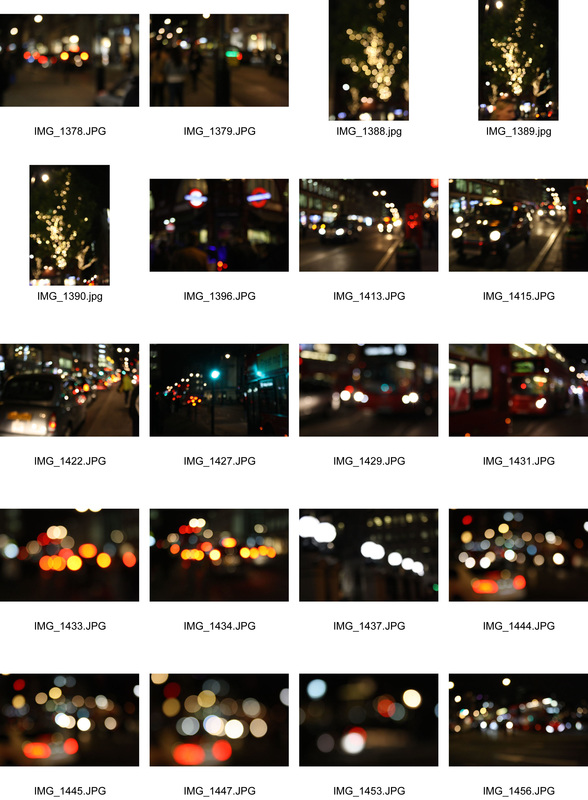
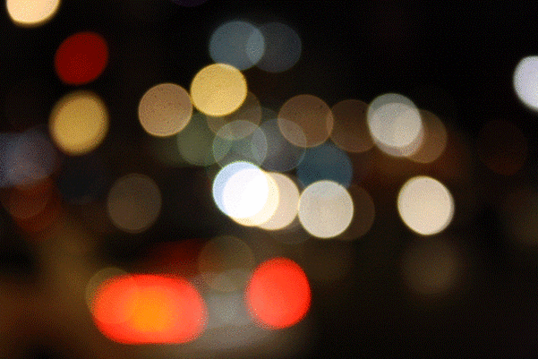
Development
To develop this stand I decided to take a less gimmicky approach in order to be more artistic and unique. In doing this, I decided to experiment with levels of light in different focuses. I took photographs in the evening so there could be a clear contrast with the vibrant reds and the black background. I found that car lights worked best and therefore I worked on finding the best focus to represent what I consider to be abstract. I will continue to develop these images as I prefer them to Michael Bosanko's work. By doing this, I may create GIFs and videos as I enjoyed responding to Bill Jacobson and find inspiration within his work.
|
|
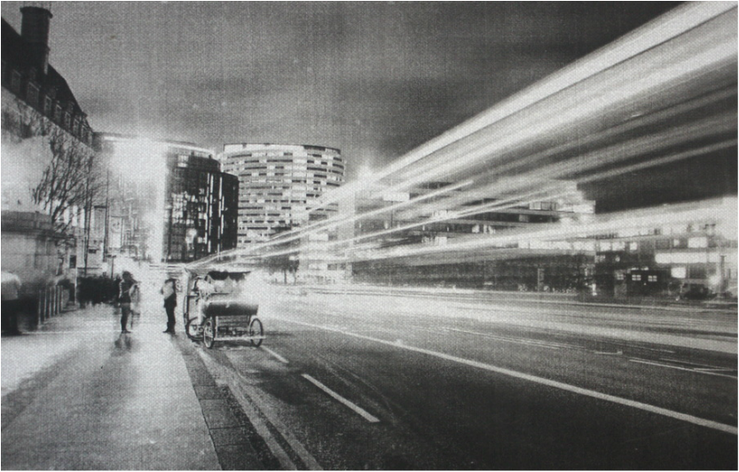
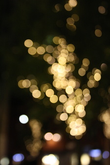
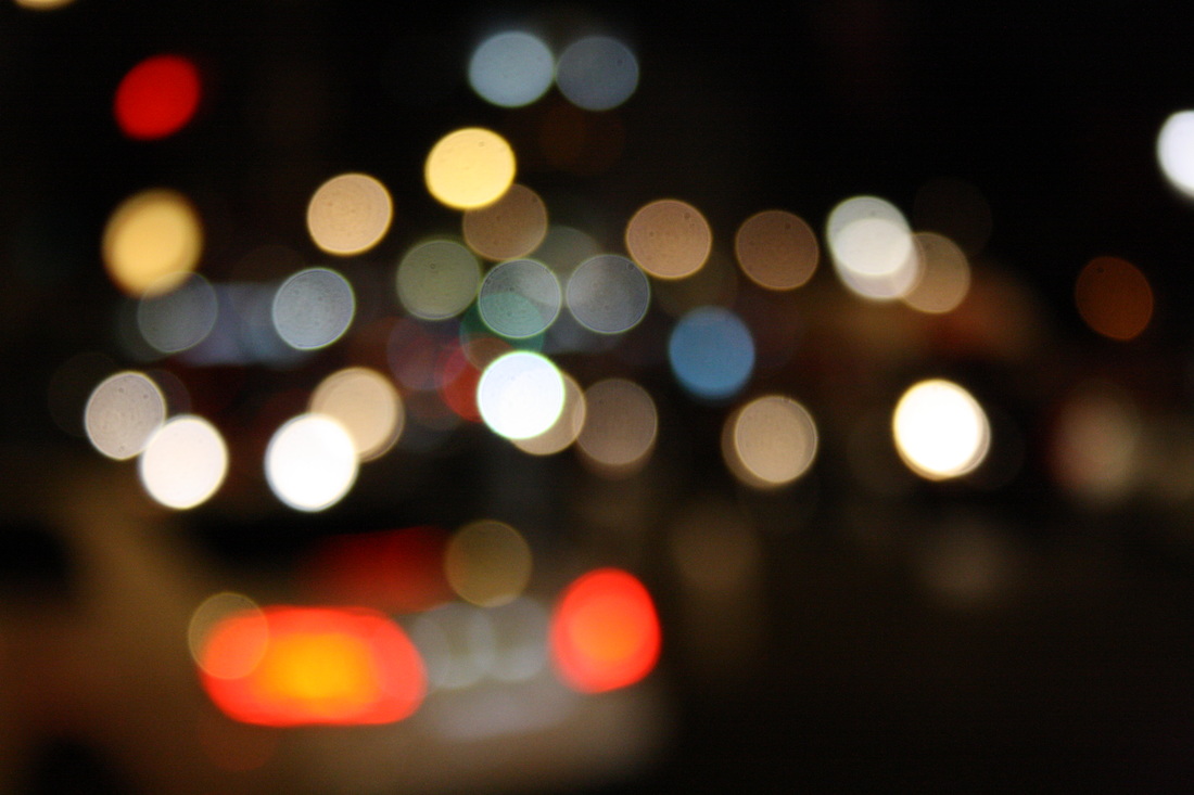
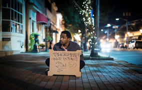
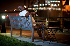
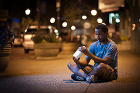
Troy Hood
In Hood's work, he works with focusing on what is in the foreground and blurring the lights in the background. This shows a contrast in detail as the foreground is in sharp focus whereas the lights in the background obtain a softer focus. This works well because the subject in the foreground always appears to be in a more melancholy mood. The images have been captured at night, linking to the mood of the subject and with a more softer background, the viewers attention is brought straight to the subject in the foreground. I liked Hood's work as it helped bring me ideas with working with blurring lights and the effect it has on the viewers.
|
|
|
Development
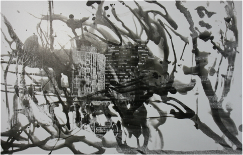
strand two - architecture
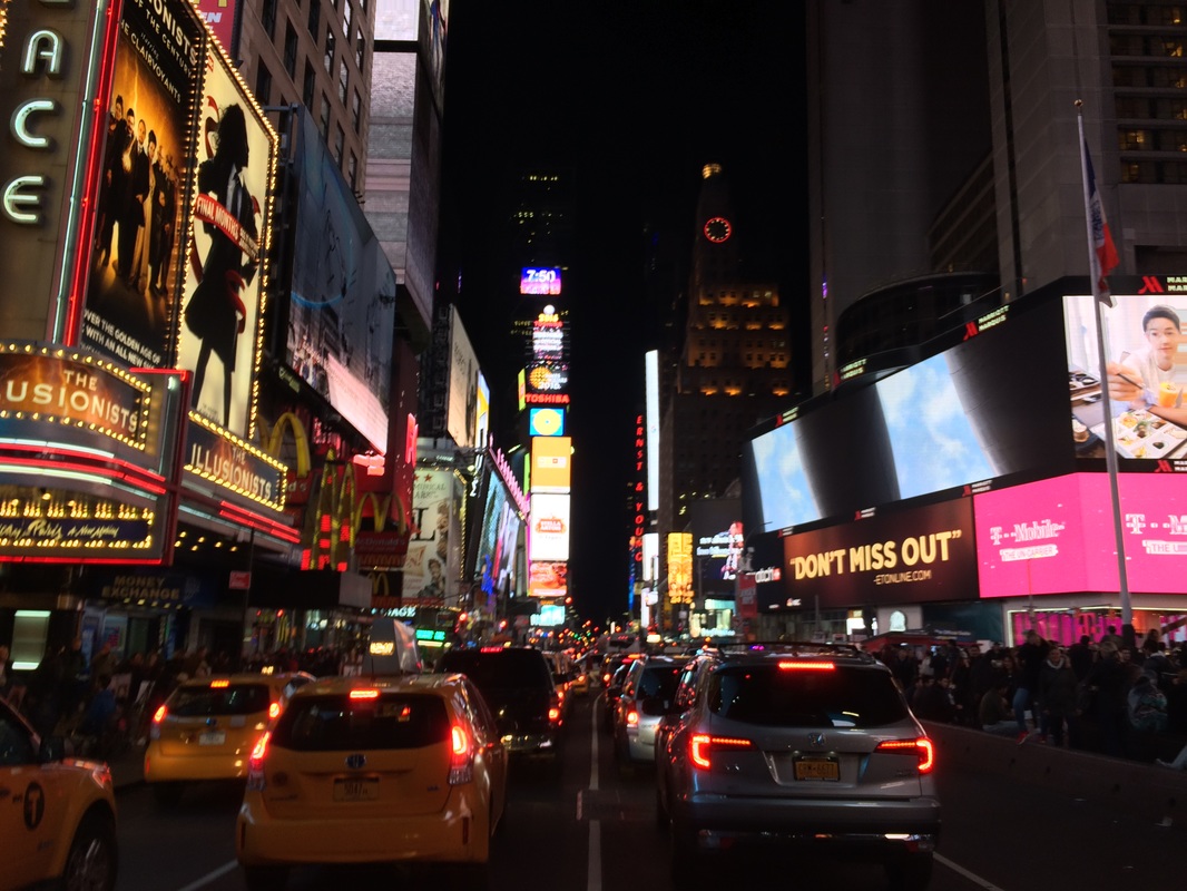
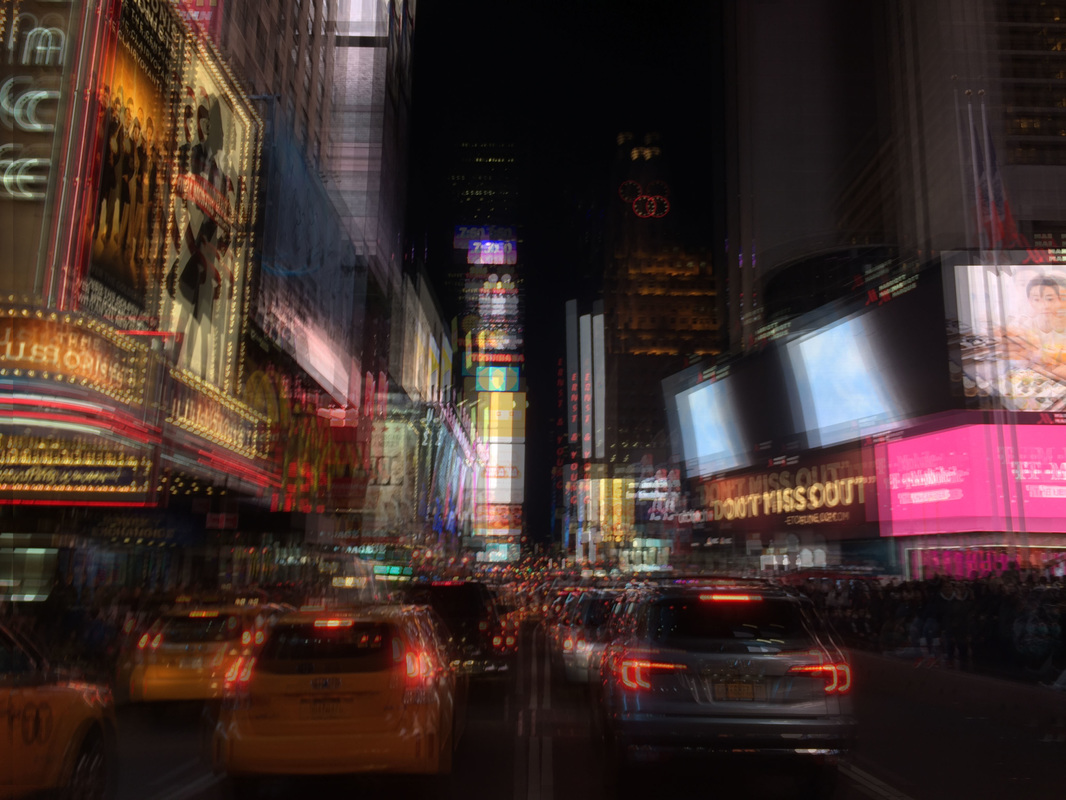
For this strand, I moved onto looking at abstraction in buildings. I used images I had taken from new York to show comparisons between my overall work and between the two cities, New York and London. I then used photoshop to edit my images and make responses to chosen artists that I had found on google.
Stephanie jung
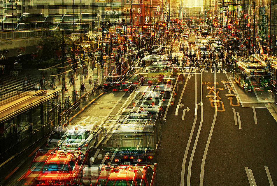
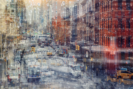
Stephanie Jung is a photographer based in Germany. She became interested in experimental photography and began to travel around the world focusing mainly on cities in order to capture the vibrant colours and busy mood of a specific place. You can see a clearly her intentions within her work as can be seen below. In the image on the left, Jung has captured the photograph with more bright, contrasting colours suggesting it could have been taken later in the day, with street and car lights present. This brings more detail towards the photograph therefore making it more interesting. To create a more abstract effect, the images have been layered and moved on top of each other. In doing this, Stephanie Jung has the intentions of showing us how hectic a city can be. The images I have selected below
|
|
my response
original image
|
photoshopped image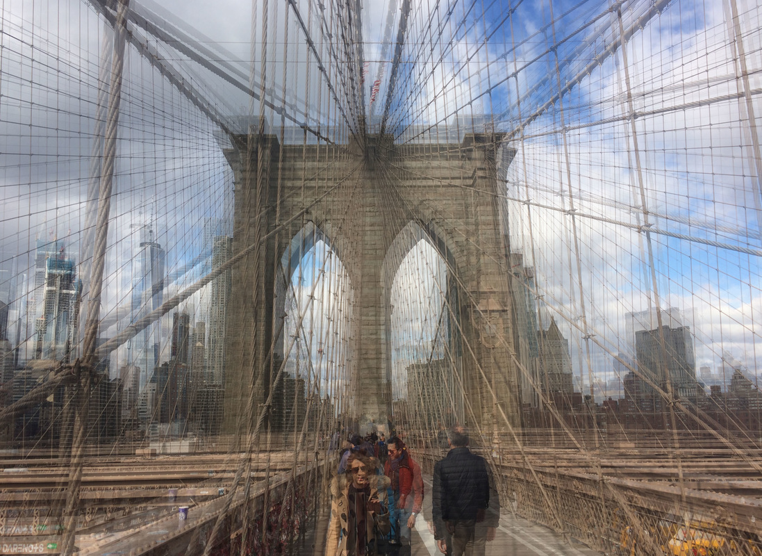
|
Overall, I feel like this strand did not go as well as I wanted it to. This is because I found it hard to create a range of responses and development to my chosen artists. I also found it difficult to find an abstract aspect to architecture and buildings in the city. To improve this I would do further research into different artists in order to broaden my imagination and come up with new, improved pieces of work.
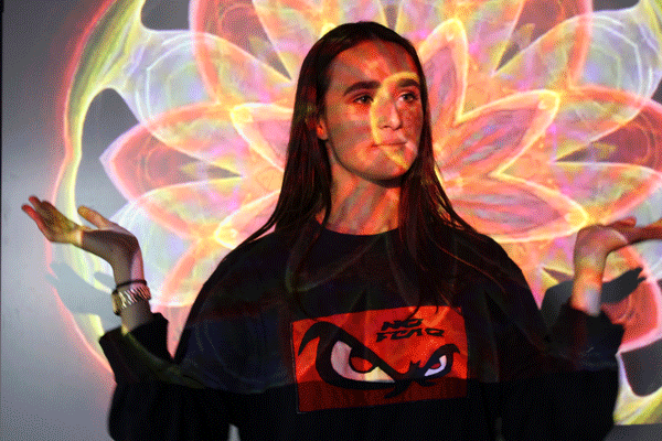
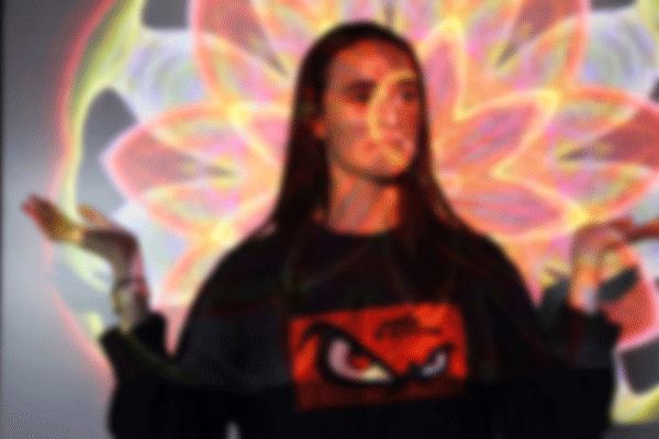
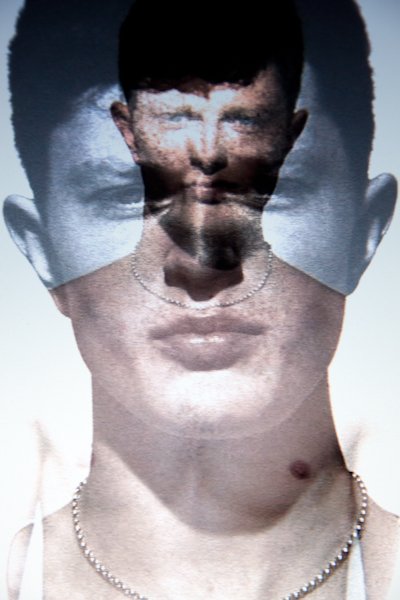
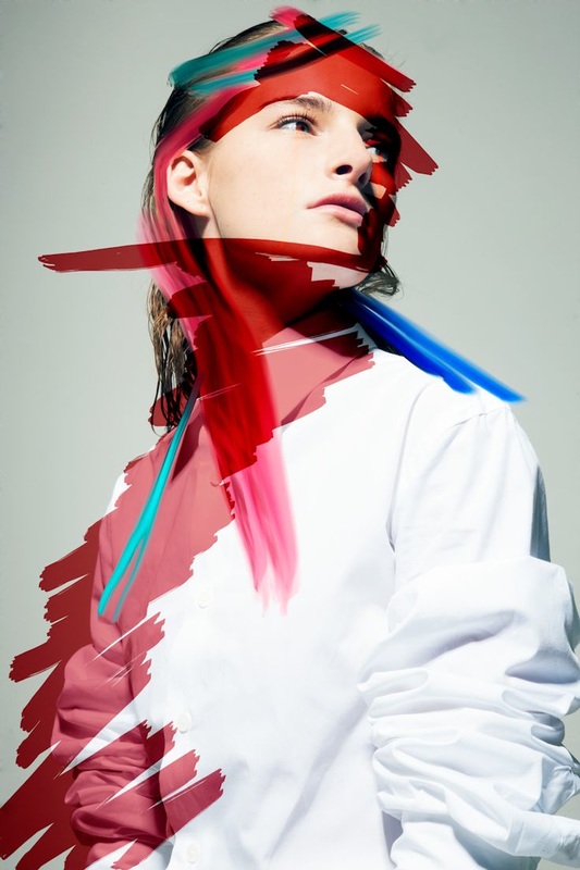
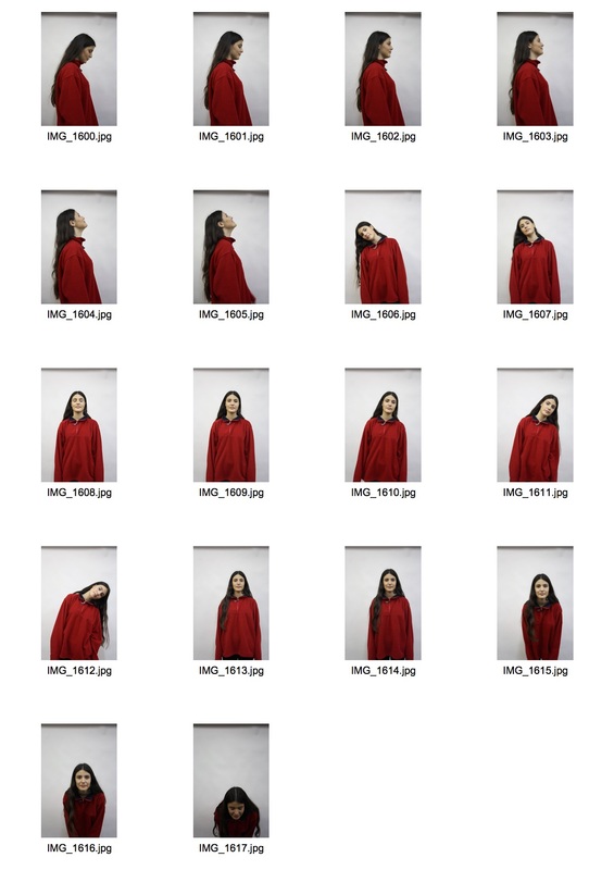
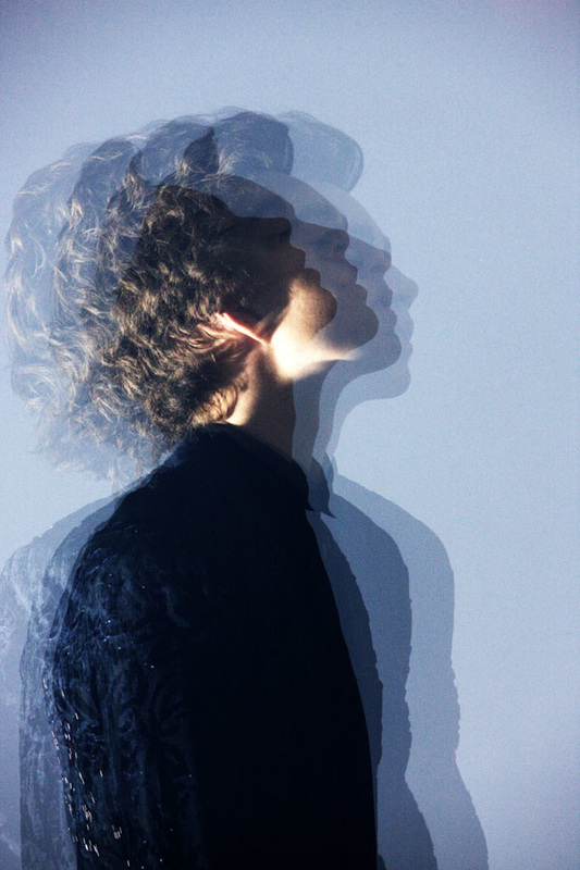
strand three - portrait transformation
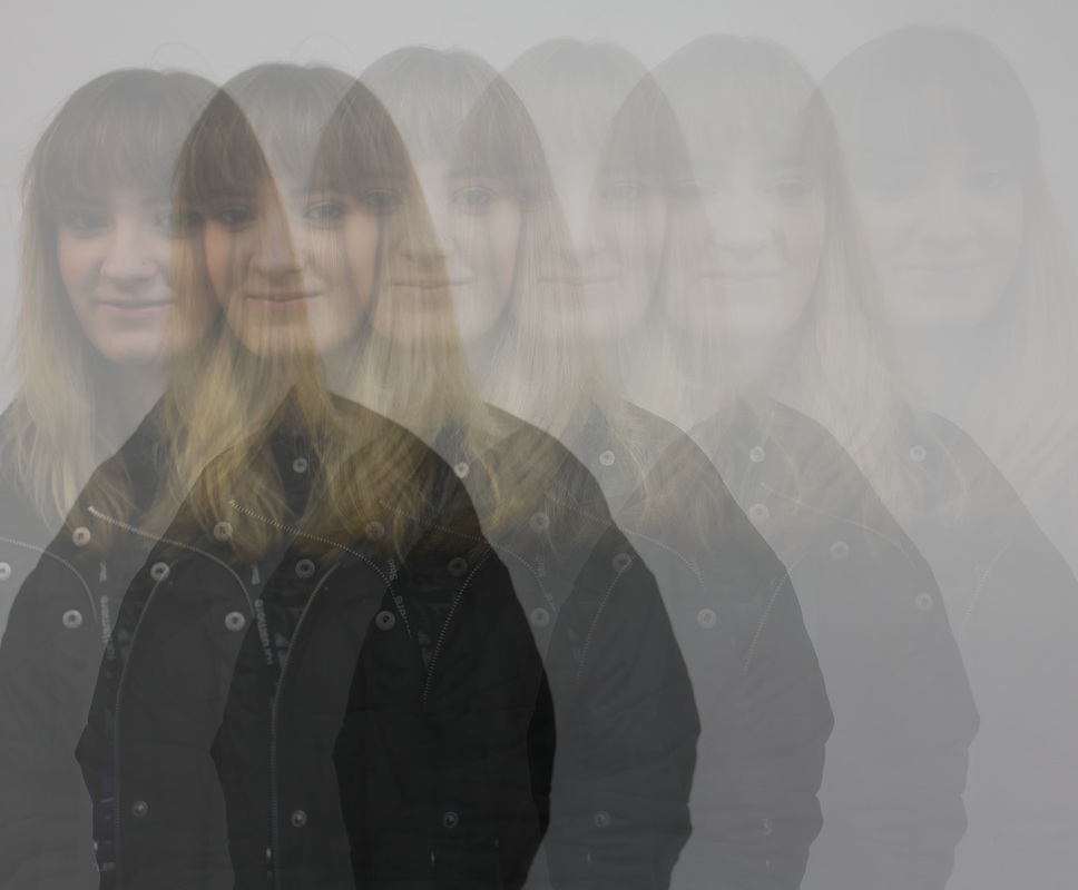
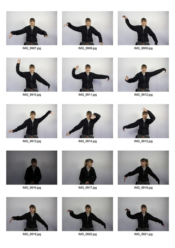
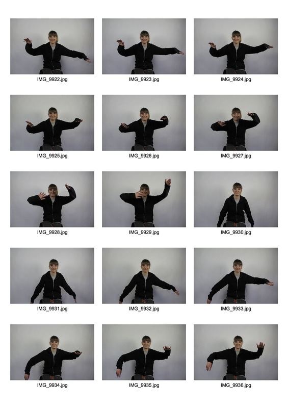
For this task, I looked at the work of Pierre Debusschere and became interested in how I could recreate his work to form abstract images. During this, I first took multiple photographs of my model of which they move slightly for each picture, Then using photoshop I layered each photograph on top of each other. When changing the opacity of each image, I was able to obtain an image which represented motion and distortion. For my first response to this, I managed to create a similar piece to Debusschere's work and therefore compared the two.
Pierre Debusschere
|
"Your photographs always present an abstract moment or a subject; a man or a woman. Why are your characters so mysterious?"
"I always want to put emotions in my work and maybe this could serve as a reason! I like when you dive into a picture, when you need time to read it ... It gives also space to create your own story while reading the image. " |
Pierre Debusschere works in with both photography and film. In the past, Debusschere has been a fashion photographer and has worked with magazines such as Vogue, Homme, Japan and Citizen K. He has many exhibitions around Europe and has presented his work during fashion week at Colette in Paris. Throughout his work, Debusschere is inspired by creating an emotional connection through merging both still life and moving elements.
|
|
|

|
My Response

|
|
Artist and Me
Pierre Debusschere's Work
|
My Response
|
although I feel that my initial response worked well, I also found that what the subject is wearing makes an impact on how the photoshopped image is perceived. This is because she is wearing a vibrant red fleece which draws the viewers attention away from the main part of the photograph. I then started to work with more a more neutral pallet to see what other kind of atmosphere and detail could be put across.
|
|
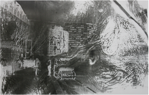
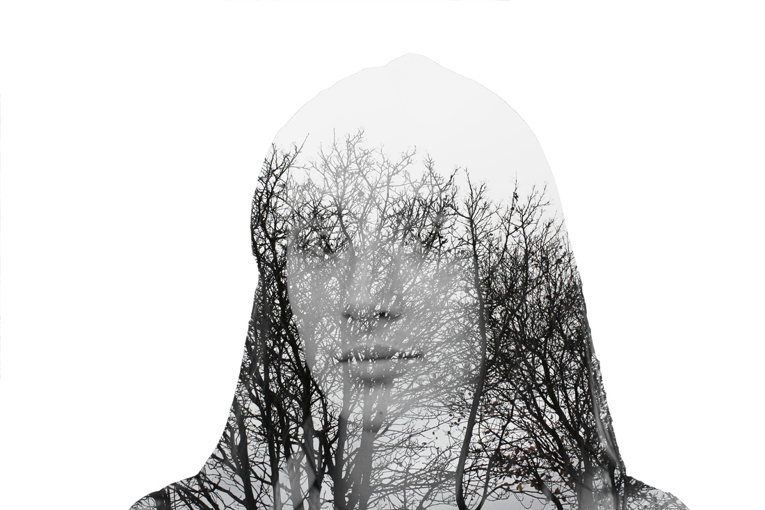
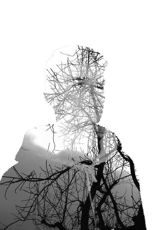
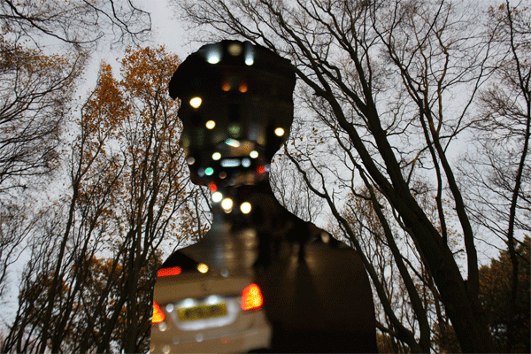
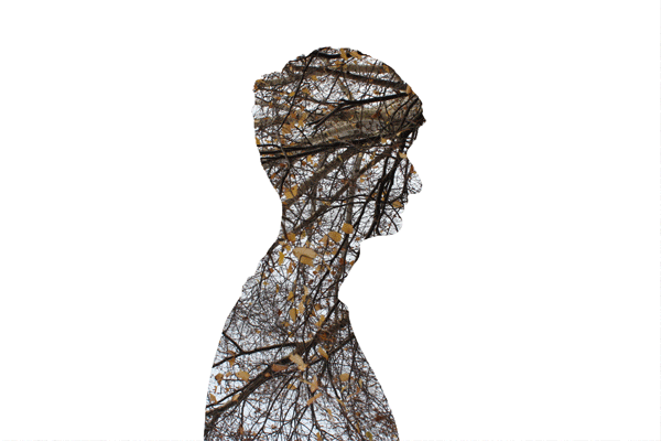
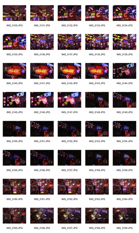
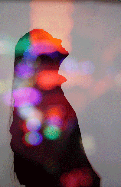
after this i moved onto looking at linking portraits and lanscapes together

|
|
|
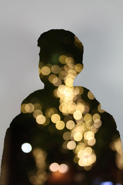
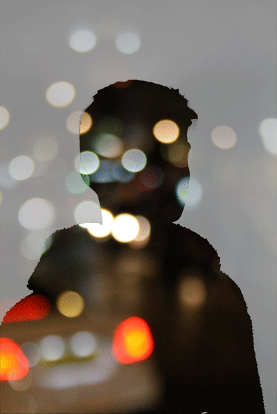
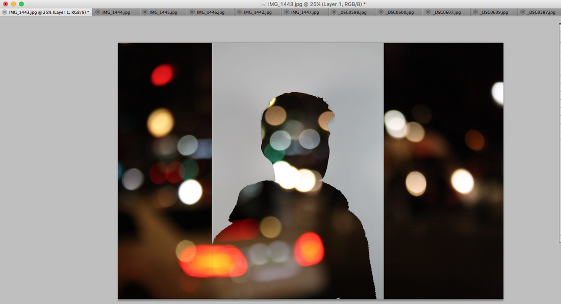
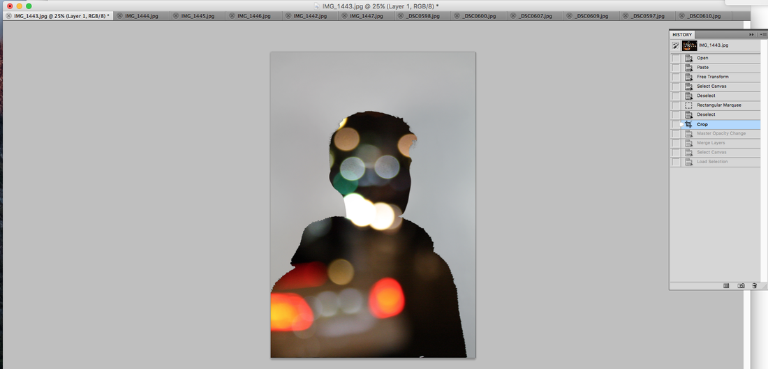
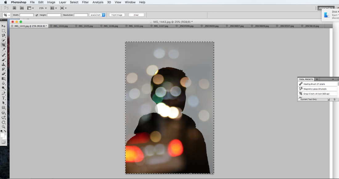
how I created this

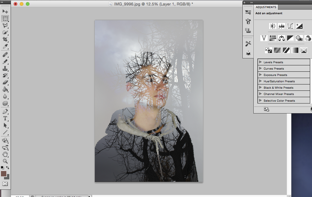
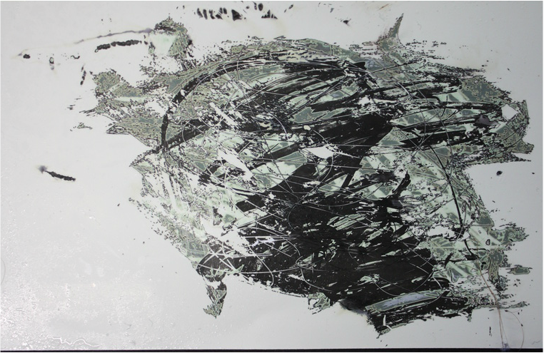
development - combining unfocused light and portrait transformation
to develop my work further I decided to look in to Jasper Jones' work and how he links portraits with surrounding landscapes and environments. I created GIF's to further develop my final outcomes.
|
|


development

development
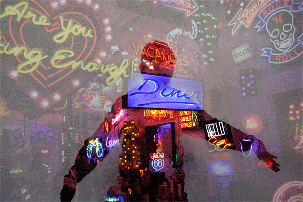
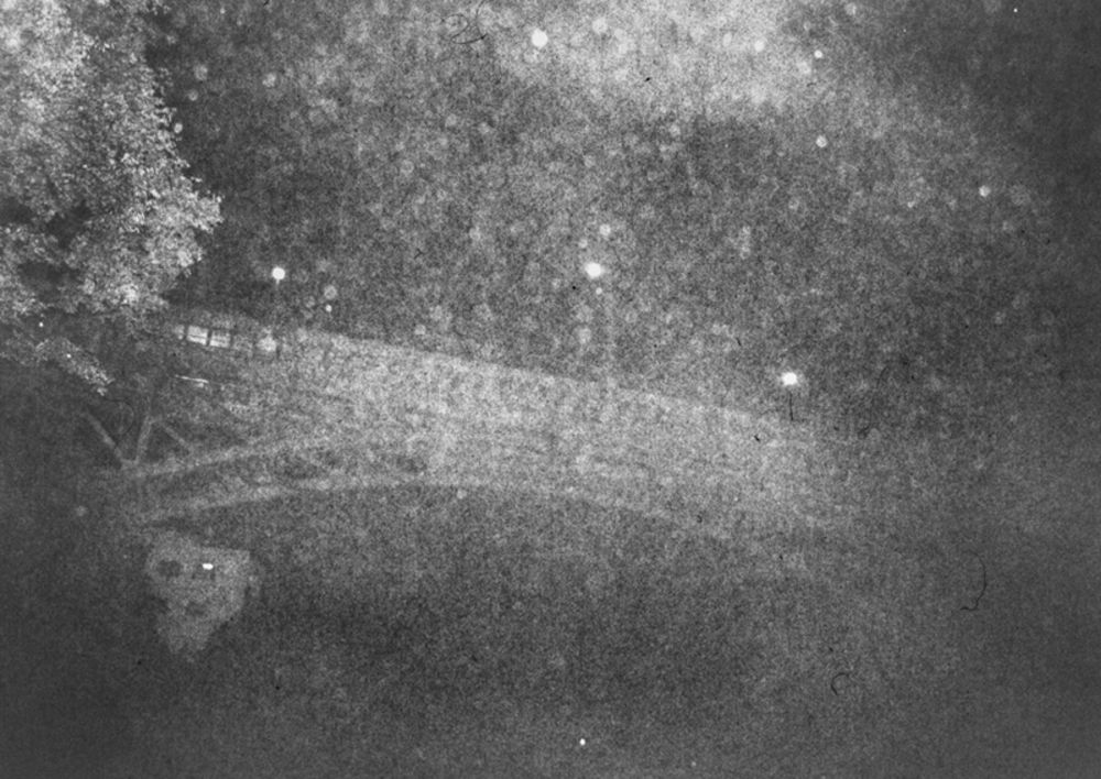
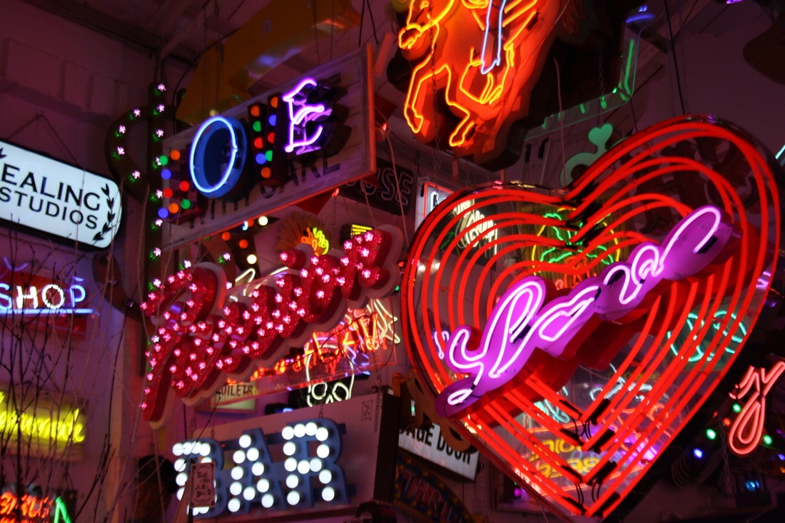
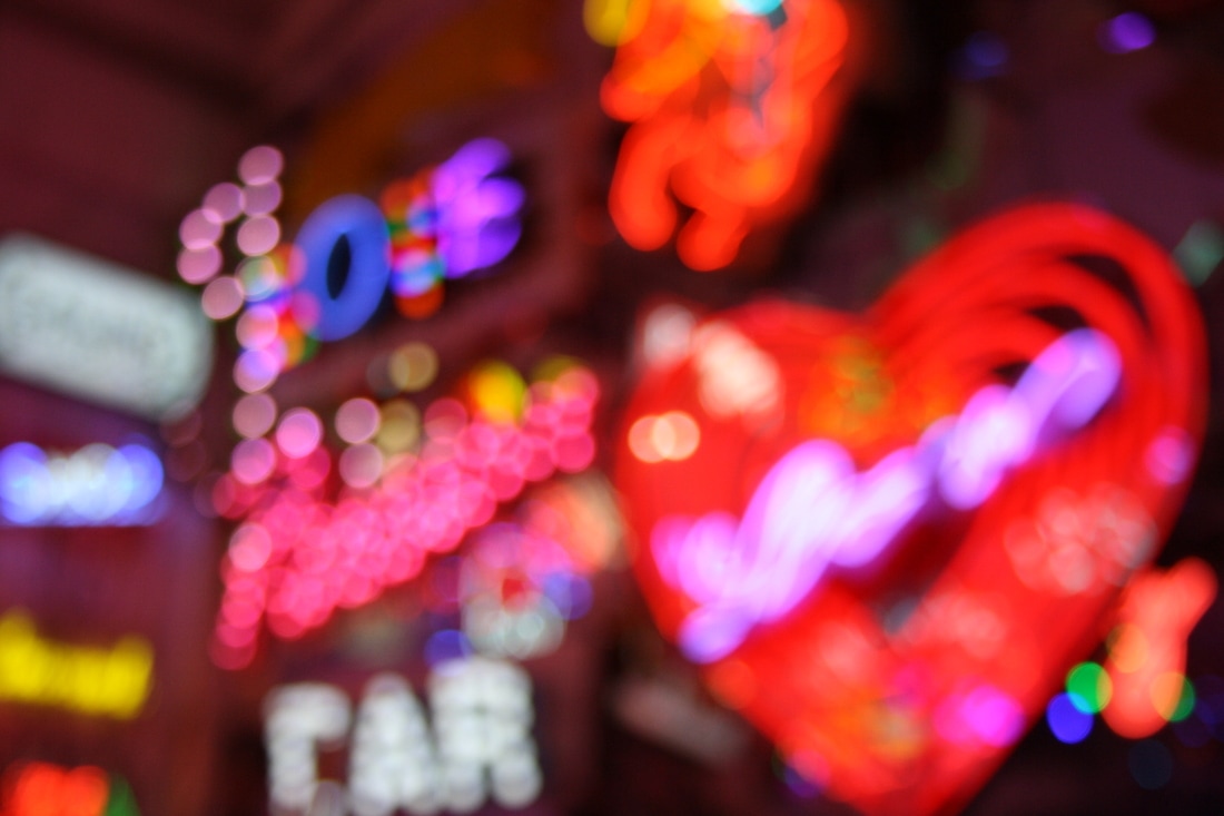
To further develop my images, I visited 'God's own junkyard' and managed to capture good images of lights using different focuses. I then went on to create GIFs of my images coming in and out of focus.
|
|
|
|
|
Essy May
|
|
Essy May is a science-fantasy artist and print designer based in London. Combining the wonder of the stars (her uncle is a renowned astronomer) with the edginess of extra-terrestrial b-movies, Essy’s digitally-coloured graphite drawings are steeped in dreaminess, influenced by the days of classic sci-fi.
This futuristic but nostalgia-driven aesthetic is embodied by Essy’s favoured working techniques: hand-drawing in pencil first, then coloured in her signature tones with an airbrush. Her work has been featured on album covers and event posters as well as print designs for Japanese fashion labels, while her prints have been exhibited in galleries worldwide. |
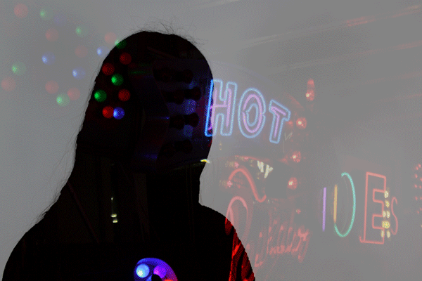
Final Piece
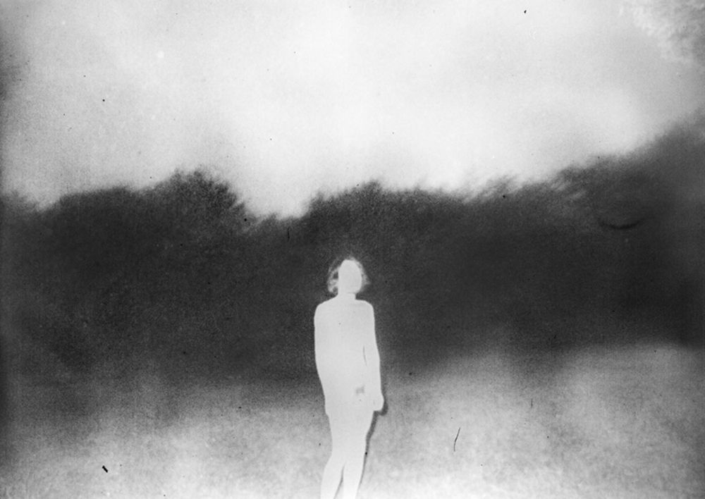
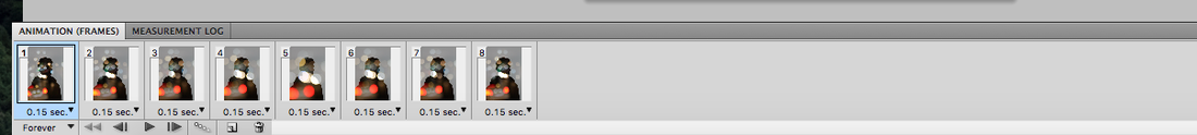
For my final piece I decided to develop my previous gifs and bring in a moving silhouette. I focused on moving and blurring lights as I feel this shows a clear link to abstraction and there is a good development from previous tasks.
|
|